

If your dashboards feel like colourful charts that still leave you guessing what really matters day-to-day, you’re not alone. Many teams build dashboards that look good but don’t actually help them manage delivery in real time. That’s usually because the dashboard is a mirror of how work is structured, not how work flows.
ClickUp Dashboards Setup
- Role-based dashboard layouts (executive, team lead, operations)
- Widgets for task counts, throughput, cycle time, overdue items
- Trend lines, comparative charts, gauges — tailored to your business KPIs
- Live data, drill-downs, filters, and cross-project scorecards
Teams often think dashboards are the solution.
In reality, dashboards reveal gaps.
ClickUp Dashboard Examples for Project Delivery
Discover where your Dashboards are holding you back
A no obligation 30-45 min practical review of your ClickUp dashboards and workflow logic – so you finally get real clarity on delivery.
Real teams that turned confusion into clarity
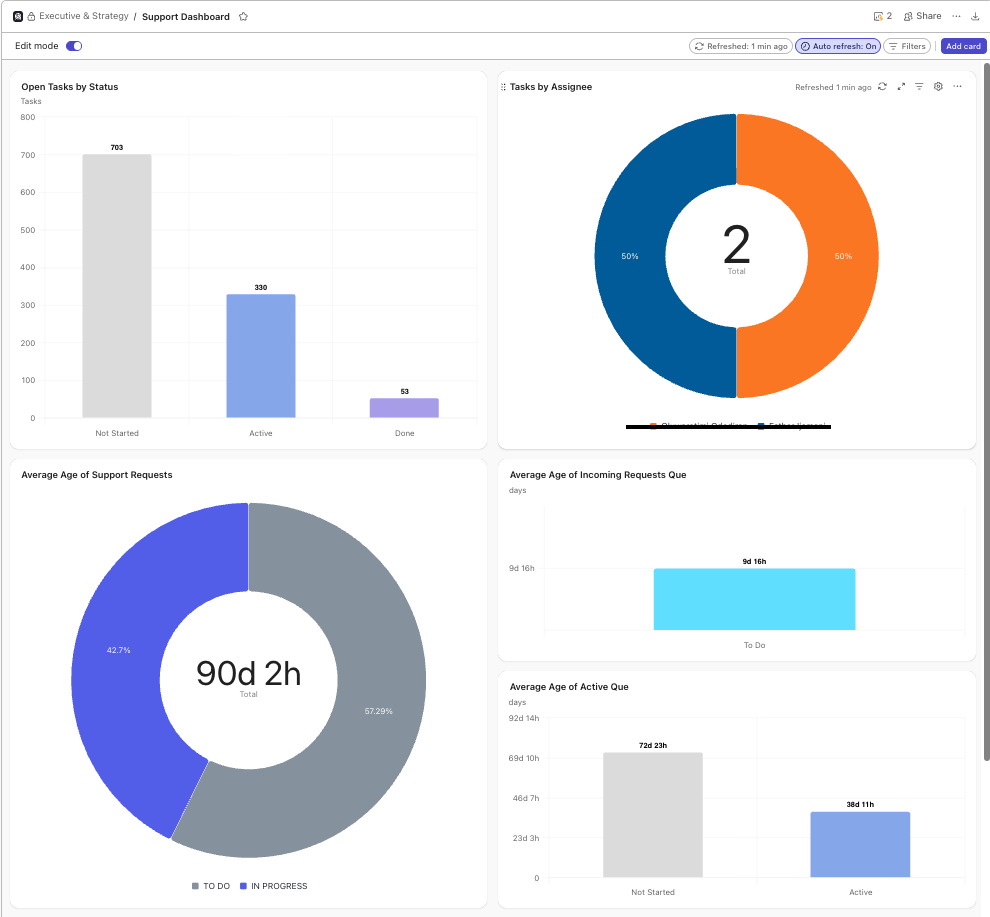
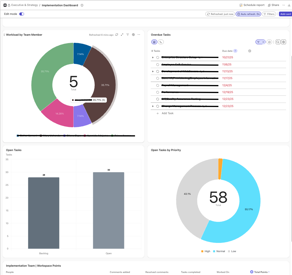
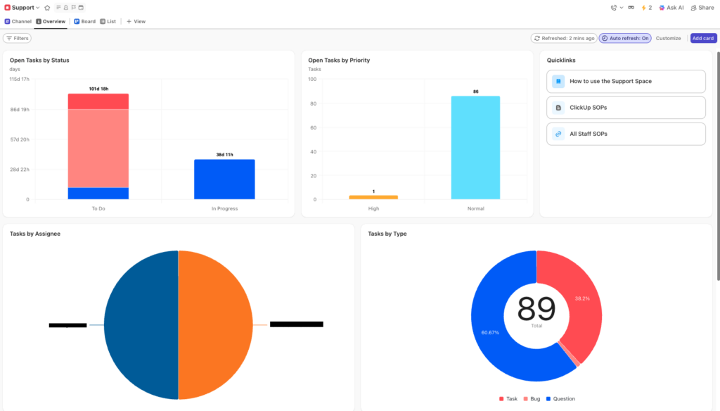
Why ClickUp Dashboards Matter for Delivery Teams
If you can’t see what’s going on, you can’t manage it. Dashboards turn raw data into insight, enabling you to spot bottlenecks, resource overloads or shifting priorities before they derail delivery.
What is Included with ClickUp Project Dashboards
- Define which metrics and KPIs are mission-critical
- Map which data sources in ClickUp feed into those metrics
- Build and test dashboards with your team
- Train, review, iterate, and embed in your operational cadence
Visibility isn’t the goal – reliable delivery is.
How Dashboards Support Workflow Optimisation
ClickUp dashboards support workflow optimisation by providing real-time visibility across the entire project delivery system. By surfacing task status, workload, priorities, and bottlenecks in a single view, dashboards enable teams to identify friction early, optimise workflows, and maintain consistent delivery without manual reporting or guesswork.
Ready to Improve Delivery Visibility?
30–45 minutes. Practical guidance. No obligation.