
In Part 1, we looked at why work feels hard long before anyone touches dashboards or automations.
Now let’s look at what happens next.
Because this is usually the sequence:
Delivery feels heavy.
Leaders want more visibility.
Someone says, “We need better dashboards.”
So dashboards get built.
Charts appear.
Metrics populate.
Everything looks… impressive.
And yet, decision-making still feels difficult.
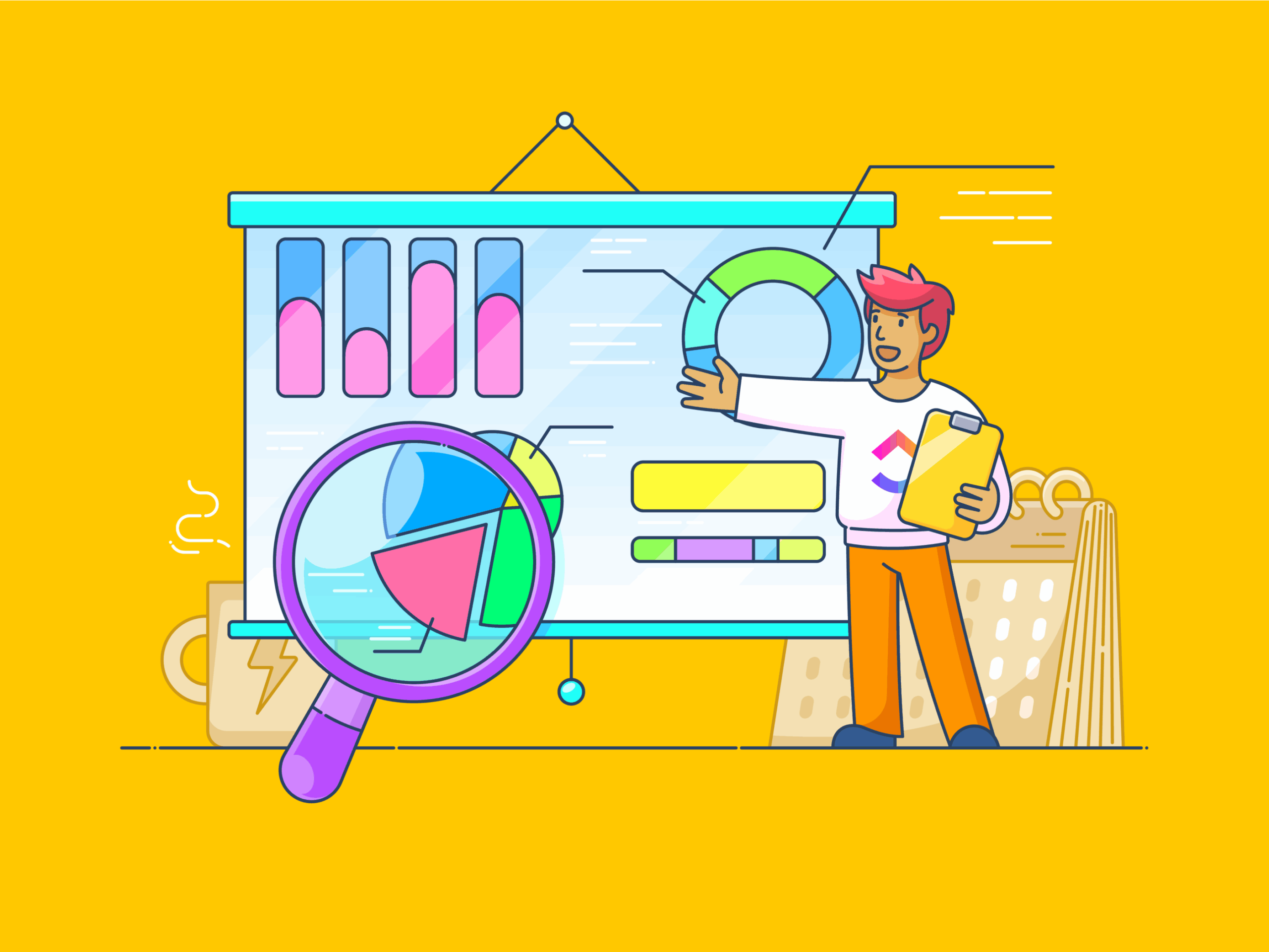
The Illusion of Visibility
ClickUp dashboards are powerful.
But they are not neutral.
They only reflect the logic of the workflow underneath them.
If your workflow design is unclear:
- Statuses mean different things to different people
- Tasks are updated inconsistently
- Ownership is ambiguous
- Dependencies aren’t tracked
Then your dashboards will faithfully visualise that confusion.
The problem isn’t that dashboards don’t work.
It’s that they work too well.
They surface whatever the system contains.
The Three Most Common Dashboard Failures
1. Reporting on the Wrong Statuses
If “In Progress” sometimes means active work and sometimes means waiting, your dashboard cannot distinguish between the two.
You’ll see:
- High volumes of “active” work
- Artificial bottlenecks
- False signals of team overload
But what you’re actually looking at is inconsistent workflow design.
Dashboards cannot correct semantic drift.
2. Measuring Activity Instead of Flow
Many ClickUp dashboards focus on:
- Number of tasks completed
- Tasks created per week
- Time tracked
These are activity metrics.
But activity is not the same as delivery.
Flow metrics are more powerful:
- Cycle time
- Time spent in each status
- Time between handoffs
- Blocked duration
If work doesn’t move smoothly through statuses, dashboards will show busyness, not progress.
3. Over-Engineering Executive Views
Another common pattern:
Complex dashboards built before the system stabilises.
Multiple widgets.
Nested filters.
Cross-space rollups.
It looks sophisticated.
But if the underlying data is inconsistent, leadership ends up making decisions based on partial signals.
That’s when dashboards start to create false confidence.
Why Dashboard Optimisation Starts with Workflow Design
Before building or refining ClickUp dashboards, ask:
- Do statuses have clear definitions?
- Is ownership explicit at each step?
- Are dependencies visible and tracked?
- Does work reliably move forward without manual chasing?
If the answer is “not consistently,” dashboard optimisation won’t fix the issue.
It will only make the noise more visible.
Dashboards are amplifiers.
They amplify clarity or chaos.
When Dashboard Optimisation Finally Works
When workflow design is strong, dashboards become calm.
- Leaders can spot risk early
- Bottlenecks are visible before deadlines slip
- Capacity conversations are grounded in data
- Decisions feel lighter
There is less urgency because there is more signal.
You stop reacting to symptoms and start managing flow.
Dashboards Are Signals, Not Solutions
If dashboards feel complicated or untrustworthy, the problem is rarely the dashboard.
It’s the workflow underneath it.
Fix the flow first.
Then measure it.
Next in This Series
This is Part 2 of a 3-part series on building ClickUp systems that actually support delivery.


Part 2: Fix the Structure Before the Widgets

Is Your Dashboard Helping or Just Reporting?
Most dashboards are very good at one thing:
showing what has already happened.
They report task counts, activity levels, and completion rates.
They confirm that work exists and that people are busy.
What they rarely do is help someone decide what to do next.
A helpful dashboard creates movement.
It highlights where attention is needed, where risk is building, and where work is likely to stall before it does.
A reporting dashboard, on the other hand:
- Looks complete but feels passive
- Requires interpretation before action
- Is checked out of habit rather than trust
If opening your dashboard doesn’t change a decision, priority, or conversation, it’s probably reporting rather than helping.
This usually isn’t a widget problem.
It’s a signal that:
- Work isn’t flowing cleanly between stages
- Ownership isn’t clear at decision points
- Statuses don’t reflect real readiness
- Priorities aren’t visible at the moment they matter
Dashboards amplify whatever structure sits underneath them.
When that structure is unclear, dashboards can only reflect the confusion back to you.
That’s why dashboard optimisation doesn’t start with rearranging charts.
It starts with asking whether your dashboard is designed to inform, direct, or simply describe.
If you’re not sure which category yours falls into, that’s often the first sign it’s time to look a little deeper.
Free. No commitment. No sales pitch.