
When a ClickUp workspace starts to feel confusing, the problem is often not the work itself. It’s the structure around it.
One of the most common issues I see in workspace audits is work being spread across too many lists, with no clear central place for the team to look. On paper, the setup may seem organised. In practice, it often creates hesitation, duplicate effort, and unnecessary admin.
People are left asking:
- Where does this piece of work live?
- Which list should I check first?
- Am I looking at the full picture, or just part of it?
That kind of uncertainty slows teams down.
In this video, I walk through two practical ways to improve clarity in ClickUp when work is spread across multiple lists. Both approaches can work. The right option depends on how your team needs to use the workspace day to day.
Option 1: Keep the structure, but improve visibility
The first approach is to keep the existing list structure in place and improve how people view the work. This works well when the current structure still makes sense from an organisational point of view, but users are struggling to navigate across it. Instead of changing where the work lives, you make it easier to see.
That might include:
- Adding top-level views that roll up multiple lists
- Creating filtered views for specific teams or workstreams
- Using Gantt views for people who need timeline visibility
- Building dashboards to report across projects, releases, or risks
This approach gives different stakeholders different lenses on the same set of work.
For example, a developer might want a saved view showing only their workstream. A project manager may need a broader list view grouped by workstream. Leadership may want a dashboard showing open tasks, release progress, and work at risk.
The benefit here is flexibility.
You keep the structure people already know, but remove some of the friction that comes from having to manually jump between lists to piece together the full picture.
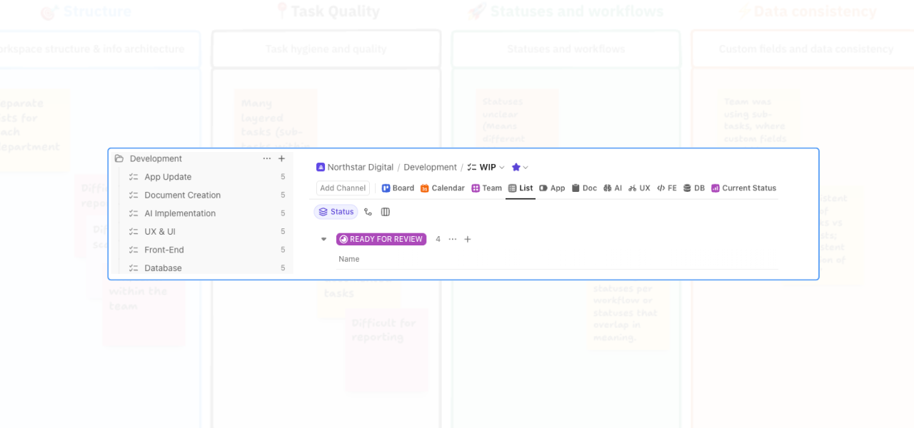
Option 2: Consolidate into one central list
The second approach is to consolidate the work into one list, then use custom fields and filtered views to organise it. This is often the better option when the biggest problem is not reporting, but clarity. In other words, the team does not just need better ways to view the work. They need one reliable place to go.
With this model, all work sits in a single list. Custom fields can then be used to show workstream, team, service area, or any other categorisation that matters. Views are filtered based on those fields, so each team member still sees a focused version of the work without losing the benefit of a shared source of truth.
That makes it easier to:
- Zoom out and see the full scope of work
- Zoom in on a specific workstream
- Reduce confusion around where tasks should be created or updated
- Keep reporting more consistent
- Make handovers easier between team members
This structure is usually less about complexity and more about confidence. When people know exactly where to look, they spend less time navigating the system and more time actually using it well.
Why this team chose consolidation to Improve Clarity in ClickUp
In this example, the team preferred the second option. The reason was simple: they wanted one central destination for their work.
Their existing setup had work spread across too many places, and that made the workspace feel harder to use than it needed to be. By consolidating into one list and using views to filter the detail, they kept the flexibility they needed without forcing the team to remember multiple locations.
That change improved clarity because it removed a layer of decision-making. Instead of asking, “Which list should I go to?” the team could go to one place first and use views from there. That may sound like a small change, but it often has a big operational impact.
Clearer navigation leads to:
- Fewer missed updates
- Less duplicated work
- Smoother project oversight
- More reliable reporting
- A better day-to-day experience for the team
The real issue is usually not the tool
When a workspace feels messy, it is easy to assume the platform is the problem. More often, the issue is that the structure no longer matches how the team actually works. That is why workspace clarity matters.
A well-structured ClickUp setup should help people find what they need quickly, understand what is happening across the project, and feel confident updating the right information in the right place.
If the setup is making that harder, it usually needs simplifying, not adding to.
When to book a workflow review
If your team is experiencing any of the following, it is probably worth reviewing the structure:
- people are unsure where work should be created
- tasks are being missed because updates are spread across multiple lists
- reporting takes too much manual effort
- different teams are working in silos inside the same workspace
- leadership cannot get a clear view of project health without extra admin
A workflow review helps you see where the friction is really coming from.
Sometimes the answer is better views.
Sometimes it is consolidation.
Sometimes it is a broader structural change.
The key is knowing which fix will make the workspace clearer and easier to use, rather than just adding another layer on top.
Final thought
If your ClickUp workspace feels harder to use than it should, that is usually a sign the structure needs attention.
The good news is that, with a few well-chosen changes, you can improve clarity in ClickUp for your team.
If you want a practical outside view on what is creating confusion in your setup, book a workflow review. I can help you identify where the friction is, what to simplify, and which changes will make the biggest difference first.
Related Content
Walk Through a ClickUp Workspace Audit with Me
How to Improve ClickUp Task Hygiene by Simplifying Nested Subtasks
How to Use Custom Fields in ClickUp to Improve Data Consistency and Reporting
Role-Specific Views in ClickUp: How to Reduce Workspace Clutter
How to Build a ClickUp Dashboard for Better Project Visibility
How to Manage Private and Public Docs in ClickUp Without Creating a Messy Workspace