
If you have already set up your lists and views in ClickUp, the next question is usually this: how do you actually see what is going on without clicking into everything one by one? This is where a dashboard becomes really useful. In this video you will create a dashboard with me:
A good ClickUp dashboard helps you pull the right information into one place so you can quickly understand what is moving, what is stuck, and what needs attention next. It is not about creating something flashy. It is about making your workspace easier to manage.
Why dashboards matter in ClickUp
Lists and views are great for organising work, but dashboards help you step back and look at the bigger picture. A well-placed dashboard can show you:
– How work is spread across different workstreams
– What stage the project is at overall
– Which tasks are at risk because they are overdue or due soon
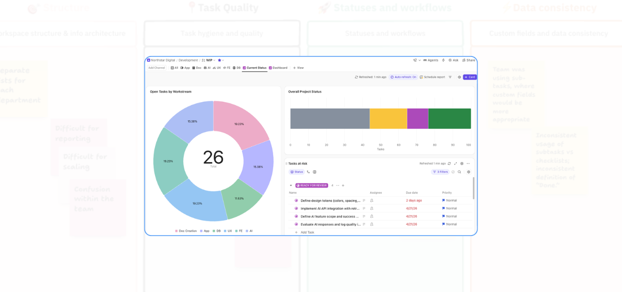
Helpful ClickUp reporting in action
That makes it much easier to manage priorities and spot issues before they turn into delays. In this example, the dashboard is built using a work-in-progress list as the main data source.
That matters because the quality of your dashboard depends on the quality of the data underneath it. If your list is up to date, your dashboard becomes a reliable reporting tool. If task statuses and due dates are inconsistent, the dashboard will be less useful.
So before building anything complicated, make sure your task data is being maintained properly.
Track work by workstream
One of the most helpful first views is a card that shows the number of tasks grouped by workstream. This gives you an immediate sense of where work is sitting across the project. In the video example, the work initially looks fairly evenly spread. But as task statuses change, that picture shifts.
That is important because it turns your dashboard from a static report into a live view of what is actually happening. If one workstream is overloaded, falling behind, or simply carrying more open work than the others, you can see it much faster.
Use status reporting to show overall project visibility in clickup
Another useful card is a project status view grouped by task status. This is a simple way to see how much work is still open, how much is in progress, and how much has been completed. As more tasks move into a closed status, your dashboard gives you a visual sense of momentum.
This is especially helpful if you are reporting on progress to a client, team member, or internal stakeholder. Instead of saying, “We are getting there,” you can show exactly where things stand.
Create a view for at-risk tasks
One of the strongest use cases for a ClickUp dashboard is risk visibility. In the video, at-risk tasks are defined as tasks that are not closed and either:
– Have a due date that has already passed, or
– Are due soon but have not been started
This is a very practical way to use a dashboard because it helps you focus on what needs intervention, not just what exists. You can adapt this depending on how you manage work. For example, your definition of “at risk” might include tasks due within the next three days, tasks with no assignee, or tasks that have had no recent activity.
The key is to decide what signals matter most in your process and build your dashboard around them.
Keep it useful, not overcomplicated
The best dashboards are usually the ones that answer a few important questions clearly. For example:
– Where is the work sitting right now?
– How far through the project are we?
– Which tasks need attention first?
You do not need to track everything. In fact, the more cluttered a dashboard becomes, the less likely people are to use it. Start with the essentials, then build out only if you genuinely need more detail.
Final thought
A ClickUp dashboard is one of the easiest ways to make your workspace feel more actionable.
When it is set up well, it helps you move from simply storing tasks to actually managing work with more confidence. You can see progress more clearly, identify risk earlier, and make better decisions without digging through multiple views.
If your ClickUp setup feels organised but still hard to oversee, a dashboard is often the piece that brings everything together.
If you want help making your workspace easier to manage, easier to report on, and easier to trust, I would be happy to help.
Related Content
Walk Through a ClickUp Workspace Audit with Me
Improve Clarity in ClickUp: 2 Practical Ways to Reduce Workspace Confusion
How to Improve ClickUp Task Hygiene by Simplifying Nested Subtasks
How to Use Custom Fields in ClickUp to Improve Data Consistency and Reporting
Role-Specific Views in ClickUp: How to Reduce Workspace Clutter
How to Manage Private and Public Docs in ClickUp Without Creating a Messy Workspace