
If you’re using ClickUp with a team, one of the most useful things you can do is check how people are actually interacting with the system. Not just whether tasks exist. But whether people are commenting, updating, completing work, and moving tasks through the workflow in a consistent way.
That’s where dashboard reporting becomes really valuable. In this walkthrough, we’re looking at how to use ClickUp dashboards to get a clearer view of team adoption and team activity, so you can spot patterns early and make better decisions about support, accountability, and delivery.
Why team adoption matters to ClickUp team visibility
A workspace can look organised on the surface and still have gaps underneath. For example, tasks may be sitting in the right lists, but if nobody is updating them, commenting, or closing them out properly, you don’t actually have reliable visibility. That makes it harder to answer simple questions like:
- Is the team working in ClickUp consistently?
- Who is actively updating work?
- Which tasks are moving forward?
- Where is work getting stuck?
If you can’t see that clearly, it becomes much harder to manage projects well.
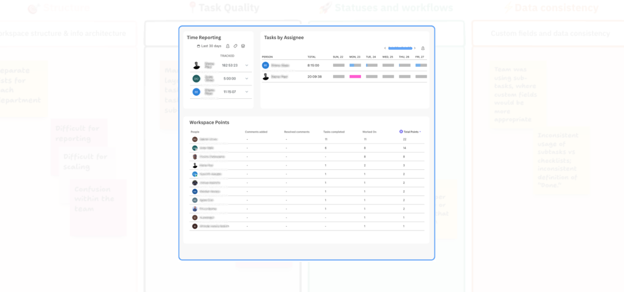
Start with dashboard cards
(ClickUp workspace points is a great starting point)
A good starting point is to add a new Dashboard view and work through the available cards. ClickUp gives you a few helpful options here, including cards for completed tasks, work broken down by assignee, activity reporting, and Workspace Points. One of the easiest entry points is Workspace Points.
This gives you a quick view of team activity, including who’s been commenting, updating tasks, and contributing inside the system. It helps you move beyond guesswork and start seeing how people are actually using the workspace.
Use “Worked On” and “Completed” to get more context
From there, you can add more cards such as Worked On and Completed. These are useful because they show not just that work exists, but whether work is actively happening. You can also filter these reports by time period. For example:
- Today
- This week
- Rolling periods
That makes it easier to review current activity rather than looking at everything all at once.
Use Filters Wisely
One really practical step is to add filters to your card. In my example, I filtered active tasks only. But, you choose what works for you. This helps clean up the view and makes the reporting more useful when you’re trying to understand workload, momentum, and where attention is needed. You can also filter by (just to name a few):
- Tag
- Status
- Date range
- Activity type
That flexibility makes it much easier to tailor the dashboard to the way your team works.
Spot tasks that are stuck too long
Another useful card is the one that shows how long a task has been sitting in a particular status. This is especially helpful if you want to keep an eye on work sitting in:
- Backlog (or Open)
- Blocked
- Another status that should only be temporary
What counts as “too long” will depend on your team and workflow, but the important thing is that you can start to define that clearly. Once you have that visibility, it becomes much easier to step in before small delays become bigger delivery issues.
Better reporting, leads to better team health
What I like about this setup is that it gives you a more granular view of team behaviour without making things overly complicated.
You can start to answer useful questions like:
- Who is engaging with tasks regularly?
- Where is work moving well?
- Which items are being ignored?
- Are people using ClickUp as intended?
That kind of visibility is often the first step toward better adoption. Because once you can see what’s happening, you can coach more effectively, improve processes, and build a workspace that actually supports the team instead of confusing them.
Final thought
If you want your ClickUp workspace to be useful, not just tidy, you need reporting that shows how work is really happening. Tracking team adoption and activity through dashboards is a simple but powerful way to do that. It helps you spot friction, improve consistency, and build much stronger operational visibility over time.
And if you’re working toward a more proactive setup, this kind of reporting also creates the foundation for monitoring overall team health in a much smarter way.
Need help improving your ClickUp setup?
If you know your workspace isn’t structured as cleanly as it could be, or you’re not confident your Workspace is set up properly, feel free to get in touch.
Related Content
Walk Through a ClickUp Workspace Audit with Me
Improve Clarity in ClickUp: 2 Practical Ways to Reduce Workspace Confusion
How to Improve ClickUp Task Hygiene by Simplifying Nested Subtasks
How to Use Custom Fields in ClickUp to Improve Data Consistency and Reporting
Role-Specific Views in ClickUp: How to Reduce Workspace Clutter
How to Build a ClickUp Dashboard for Better Project Visibility
How to Manage Private and Public Docs in ClickUp Without Creating a Messy Workspace